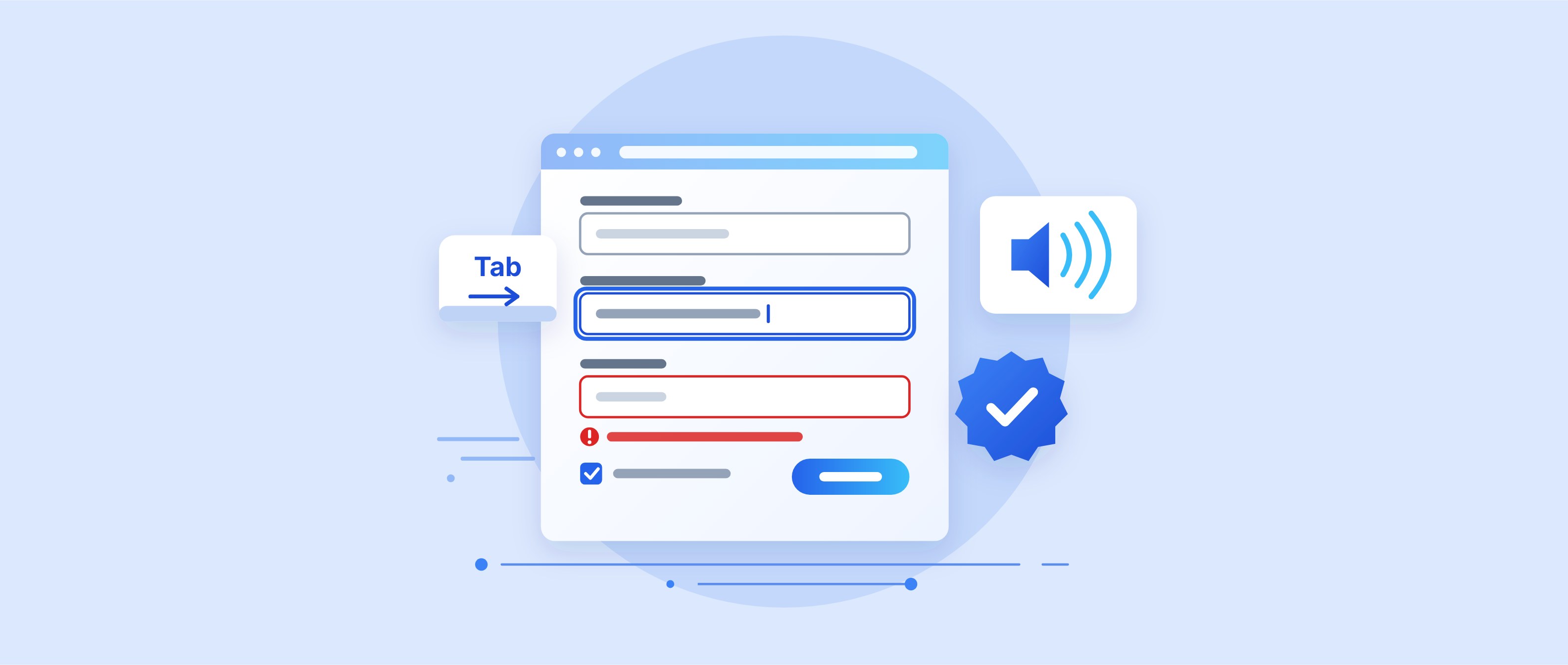
Building Accessible Forms: A Guide for Online Shops
Accessible form fields decide whether people can order in your online shop. This guide covers the requirements, techniques and tests for accessible form fields.
Summary
For online shops covered by Germany's Accessibility Strengthening Act (BFSG), accessible forms are mandatory: since 28 June 2025, the law requires services in electronic commerce to be perceivable, operable, understandable and robust. Section 19 BFSGV explicitly names identification, authentication and payment. The technical benchmark is EN 301 549, whose new version V4.1.1 of 2 September 2026 moves to WCAG 2.2 AA. The essentials are a linked label for every input field, explained required fields, error messages in text, full keyboard operation and the checkout criteria 3.3.7 and 3.3.8. As of 10/27/2026.
Newsletter sign-up, customer account or checkout: almost every sale in an online shop runs through a form. That is exactly where many people get stuck, when input fields have no label, errors are only marked in red, or the login cannot be operated with a keyboard. Since 28 June 2025, Germany's Accessibility Strengthening Act (BFSG) has required online shops to be perceivable, operable, understandable and robust for consumers. Accessible forms are therefore not a detail but the core of the obligation.
This guide explains which requirements apply to accessible forms, how to build labels, required fields and error messages cleanly in code, why checkout is the biggest hurdle, and how to test the result before customers fail.
What makes forms accessible
A form is accessible when everyone can fill it in and submit it without help: with a mouse, with a keyboard, with a screen reader, with magnification or with voice input. The benchmark is the Web Content Accessibility Guidelines, or WCAG. The current version, WCAG 2.2, is a W3C Recommendation whose valid edition is dated 12 December 2024.
In practice, the requirements come down to four questions:
- Perceivable: Does every input field have a visible label that is linked to it in the code, and do text and field borders have enough contrast?
- Operable: Can all form fields be reached without a mouse, does the focus stay visible, and are buttons large enough?
- Understandable: Are required fields and formats explained up front, and do error messages say what is wrong and what correct input looks like?
- Robust: Do browsers and assistive technologies recognise the name, role and state of every element, including custom select fields?
According to Germany's Federal Statistical Office, just over 7.8 million people with a severe disability lived in Germany at the end of 2025, or 9.4 percent of the population (press release of 13 July 2026). But accessible input fields do not only help them. Clear labels, understandable hints and auto-filled addresses speed up purchases for all users, including on a smartphone and for people with temporary impairments, such as a broken arm. How this can affect conversions is covered in our article More conversion through inclusion.
Which requirements apply to forms in a shop
Accessible design in shops falls under the BFSG, public bodies under the BITV 2.0, and technically both lead to the same criteria. The BFSG governs services in electronic commerce. Section 19 of the accompanying ordinance (BFSGV) states that identification, authentication, security and payment functions must be perceivable, operable, understandable and robust where they are part of the service. That directly affects login, customer account and the payment step.
How to meet these requirements technically is set out in the European standard EN 301 549, which adopts the WCAG success criteria for web content. Under Section 4 BFSG, conformity is presumed when a service meets harmonised standards whose references have been published in the Official Journal of the EU. According to Ireland's National Disability Authority, the new version V4.1.1 has been published since 2 September 2026 and moves to WCAG 2.2 Level AA. The authority expects citation in the Official Journal on 16 December 2026. Until then, version V3.2.1, based on WCAG 2.1, remains the cited reference. What this means for shops is explained in our article EN 301 549 V4.1.1: what changes for online shops.
The revised BITV 2.0 has applied to federal public bodies in Germany since 25 May 2019. It explicitly names forms and authentication as areas that should aim for the highest possible level of accessibility. The BITV is not binding for shop operators, but it shows which areas legislators consider particularly critical.
Practical assessment: If you are having new forms built today, base them directly on WCAG 2.2 AA. Several of the six new criteria affect input fields and checkout in particular, and once the new standard is cited in the Official Journal they become the benchmark for the presumption of conformity. The exact timing is not yet legally settled, but the technical direction is clear: accessible controls according to WCAG 2.2 AA are the professional benchmark.
The key WCAG criteria for forms
About a dozen success criteria decide whether a form is accessible. The overview below summarises them based on the wording of version 2.2 (W3C Recommendation, as of 12 December 2024). Checking each individual form is still up to you.
| Criterion | Level | What it requires in a form |
|---|---|---|
| 1.3.1 Info and Relationships | A | Labels and groups are linked in the code, not just visually. |
| 1.3.5 Identify Input Purpose | AA | Fields for name, address or email expose their purpose in a machine-readable way. |
| 1.4.11 Non-text Contrast | AA | Field borders and controls reach at least 3:1. |
| 2.1.1 Keyboard | A | Every function can be reached without a mouse. |
| 2.4.11 Focus Not Obscured (Minimum) | AA | The focused field is not entirely hidden by banners or sticky bars. |
| 2.5.8 Target Size (Minimum) | AA | Click targets measure at least 24 × 24 CSS pixels unless an exception applies. |
| 3.3.1 Error Identification | A | Input fields in error are identified and the error is described in text. |
| 3.3.2 Labels or Instructions | A | Information that users must provide has a label or an explanation. |
| 3.3.3 Error Suggestion | AA | The message says what correct input looks like. |
| 3.3.7 Redundant Entry | A | Information already provided is filled in again or offered for selection. |
| 3.3.8 Accessible Authentication (Minimum) | AA | Login does not require a cognitive function test without an alternative or help. |
| 4.1.2 Name, Role, Value | A | Custom components also report name, role and state to assistive technologies. |
Four of these criteria are new in version 2.2: 2.4.11, 2.5.8 and the two checkout criteria 3.3.7 and 3.3.8. Our knowledge page on WCAG 2.2 gives an overview of all changes.
Building accessible forms: labels, hints, structure
Most problems appear as soon as teams plan a new form with a focus on looks rather than semantics. Accessible form fields therefore start in the code, not in the design. The forms tutorial by the W3C Web Accessibility Initiative (WAI), last updated on 27 March 2026, sets out a clear order: give every control a label, group related form fields, provide hints, validate input and notify users of success or errors.
Labels and labelling
Every input field needs a label, in other words a <label> element linked to it via for and id. The W3C calls this explicit association the preferred method because assistive technologies read it most reliably. An example of a postcode field:
<label for="postcode">Postcode</label><input id="postcode" name="postcode" autocomplete="postal-code">
For checkboxes, the label sits to the right of the box:
<input type="checkbox" id="news"><label for="news">Subscribe to newsletter</label>
You can build more complex forms on the same pattern. A screen reader then announces "Postcode, edit text" on focus instead of just "edit text". An accessible label is short, unambiguous and placed visibly above or to the left of the field, and to the right of checkboxes. The name attribute matters for submitting the data, but it does not replace a label: assistive technologies do not read it out as a label. For people who cannot see, the label is often the only information about the purpose of an input field, and only then is the field accessible to assistive technologies.
Placeholder text does not replace a label. It disappears when typing starts, usually has low contrast, is hard to read for people with low vision and is not reliably recognised as a label by screen readers. Important content should therefore never sit only in the placeholder. An invisible label via aria-label only makes sense where the purpose is clear from context, such as a search field with a magnifier button. The button itself also needs a name: "Buy now" as text in the button, not an icon without a label.
Required information and hints
Accessible required fields are recognisable before a person starts filling in the form. Otherwise it is unclear which information is missing. The W3C recommends explaining the marking before the form and writing the information directly into the label, for example "Email address (required)". An asterisk alone is only enough if its meaning has been explained beforehand. The HTML attribute required adds the marking technically. Format hints for information such as dates ("DD/MM/YYYY") also belong in the label or are linked to the field via aria-describedby so that assistive technologies read them out too.
Structure and autofill
Related input fields such as billing address, delivery address or payment method are grouped with <fieldset> and <legend>. This accessible structure tells a person using a screen reader whether "Street" belongs to the delivery or the billing address. For criterion 1.3.5, the W3C names the autocomplete attribute as a sufficient technique, with values such as given-name or email and the billing and shipping tokens for two sets of address fields. The browser can then suggest stored data. This helps people with motor or cognitive impairments and shortens checkout for all users. If you are having an address form rebuilt, define the autocomplete values at the same time.
Reporting errors clearly
Accessible error messages have to say in text which field is affected, what is wrong and what correct input looks like. Colour may support this but must never carry it alone: that is how the W3C puts it in its explanation of criterion 3.3.1. A field with a red border and no text does not meet the requirement, and people with colour vision deficiency often do not notice the marking at all. In its guide of 10 September 2024, the German retail association Händlerbund gives a good example: "Please enter a valid postcode consisting of five digits."
For validating input, the WAI tutorial on user notifications recommends several building blocks that can be combined:
- Error summary at the top: A list above the form with its own heading names all errors and links directly to each field, so users can correct them right away.
- Error at the field: The message sits right next to it and is linked via
aria-describedbyso that assistive software reads it out on focus. - Move the focus: After a failed submission, the focus jumps to the first field in error or to the error summary.
- Update the page title: A title such as "3 errors: billing address" informs blind users as soon as the page reloads.
- Announce dynamic hints: If the form validates without reloading,
role="alert"or a live region makes the message audible.
Timing matters too. The W3C advises checking strict formats such as dates only when the user leaves the field, because messages while typing would otherwise keep interrupting. Information already entered must not be lost after an error. For orders, criterion 3.3.4 (Level AA) applies as well: for legally or financially binding actions, submissions must be reversible, checked for errors, or open to review and correction before they are finalised. The W3C points to an order summary showing items, delivery address and payment method before the buy button. It only meets the requirement if the summary itself is accessible. Write error texts together with the form, not as an afterthought.
Checkout as the acid test
Checkout is where all requirements meet, and here every problem costs revenue directly. The Händlerbund points out that payment functions from third parties such as PayPal count towards an accessible customer journey too. A scenario shows which problems are typical:
A person uses a screen reader and operates the shop without a mouse. In the cart, the quantity field is a custom plus-minus element without a name, so the speech output only says "button". In the address step she has to type the delivery address again, even though it matches the billing address. At login, the password field blocks pasting from her password manager. And while tabbing, the focus disappears behind a sticky cookie banner.
Each of these points has its own criterion. Criterion 3.3.7 requires that information from the same process is filled in automatically or offered for selection. The W3C explicitly gives the example of letting users confirm that billing and delivery address are the same. Criterion 3.3.8 prohibits cognitive function tests at login unless an alternative or help is available. For people with cognitive impairments, recalling a password from memory is a real hurdle. According to the W3C, a shop fails this if it blocks pasting into login fields, locks out password managers or requires users to retype a verification code instead of pasting it. CAPTCHAs with arithmetic or logic puzzles are not exempt, while object recognition is exempt at Level AA.
If individual input fields are accessible but the payment step is not, the purchase still fails. Shop systems often provide an accessible foundation, but never the whole solution. Plugins, custom templates and embedded content from payment services change the result. How this plays out on one specific platform is shown in our article Shopify accessibility: checking theme, apps and checkout.
Testing accessible forms
Only testing shows whether a form is accessible. The best approach has three stages: automated, by keyboard and with a screen reader. Automated checks quickly find a missing label, low contrast and missing attributes, but they cannot detect every problem, such as whether a message is understandable or whether the order and structure of the form fields make sense. How to proceed methodically is explained on our knowledge page Checking for barriers correctly.
- Keyboard test: Go through the form using only Tab, Shift+Tab, Space and Enter. Keyboard accessibility means every field can be reached, the focus indicator must be visible, and no element may trap the focus. This is how many people with motor impairments move through your form.
- Screen reader test: If possible, have the form tested by a person who uses a screen reader every day. With NVDA on Windows or VoiceOver on a Mac, check for yourself whether every field announces its label, its type and the required hint, and whether error messages are read out.
- Measure contrast: Under criterion 1.4.3, text needs at least 4.5:1, and under 1.4.11, field borders and focus outlines need at least 3:1. You can check the contrast ratio with the SiteCockpit contrast checker.
- Trigger errors: Submit the form empty and with wrong formats on purpose. Check whether messages appear as text, whether the focus follows and whether users keep the data they have already entered. Embedded third-party forms, such as for payment or booking appointments, belong in the test as well. Only when all four tests pass is the form truly accessible.
Ideally, test while you are building forms, not after they go live. A clear order of priority helps: checkout and customer account first, then contact and returns forms, and newsletter and prize draws last. Why this weighting makes sense is explained in our article The costliest barriers and their priorities.
SiteCockpit: keeping forms in view
Accessible form fields are not a one-off project. Every new plugin, every template update and every new payment provider can remove a label or move the focus. Also check forms that plugins generate automatically. That is why accessible processes need ongoing checks rather than a snapshot.
- easyMonitoring: continuously monitors your pages and detects typical form errors, such as a missing label, weak contrast or invisible keyboard focus, with prioritised tasks.
- Manual audits: check what no tool can see, such as whether a checkout works from start to finish with assistive software and whether messages are understandable.
- easyVision: lets visitors, such as people with low vision, adjust contrast, font and spacing themselves. The widget complements fixing barriers in the code, but does not replace it.
In the dashboard you can see the conformance scores of your pages over time. That way you notice whether an update has made a form worse before customers do.
What makes sense now
Building accessible forms is mostly careful HTML work, not a major project. Most barriers can be fixed with labels, a clear structure, text messages and autocomplete. It gets more demanding with custom components and third-party payment services. No reason to panic, but a real need for action, especially in checkout.
- Assess the current state: List all forms and test checkout, login and contact form first, without a mouse and with a screen reader.
- Fix the most common errors: A missing label, unclear required fields, colour-only error messages and blocked pasting at login have the biggest impact.
- Keep it in view: Check again after every update and build new forms according to WCAG 2.2 AA from the start.
Proceed step by step and start where users buy. With easyMonitoring you then keep your forms permanently in view and see new errors as soon as they appear.
How accessible are your forms?
Test your website for free with the SiteCockpit Livecheck and get an initial assessment in under 60 seconds.
Test now for freeRead more – WCAG & Technology
WCAG 3.0: What Businesses Should Prepare For Now
WCAG 3.0 is still in the works, WCAG 2.2 stays legally binding. What changes and what to do now.

Achieving WCAG compliance - step by step
Achieve WCAG 2.2 compliance: the basics, the four principles and a 5-step guide to an accessible, legally compliant website.